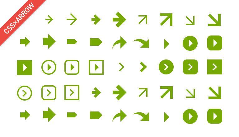
最近ではCSS3の対応ブラウザが増えたおかげで、画像を使わずともサイト上で色々な表現ができるようになりました。
CSSでデザインの実装を行う場合、「カスタマイズやメンテナンスが容易」「レスポンシブWebデザインとも相性が良い」「画像を読み込まないのでモバイルユーザーにも優しい」「Retinaディスプレイなど高解像度の環境で見ても綺麗」等、制作側とユーザーの両方にメリットがあります。
今回は、フラットデザインのWebサイトなどでよく見かける、シンプルな矢印アイコンのCSSをいくつかご紹介したいと思います。
目次:
1. 共通HTML&CSS
共通で使用するHTMLとCSSは以下の通りです。
class名「arrow」は共通、「sample1-1」は使いたい矢印アイコンのclass名に変更を行ってください。
HTML:
<a href="#" class="arrow sample1-1">共通のHTML</a>CSS:
.arrow{
	position: relative;
	display: inline-block;
	padding: 0 0 0 16px;
	color: #000;
	vertical-align: middle;
	text-decoration: none;
	font-size: 15px;
}
.arrow::before,
.arrow::after{
	position: absolute;
	top: 0;
	bottom: 0;
	left: 0;
	margin: auto;
	content: "";
	vertical-align: middle;
}2. シンプルな矢印アイコン
オーソドックスでシンプルなデザインの矢印アイコンです。
:before疑似要素で長方形を作り、その隣に:after疑似要素にて上辺と右辺のみborderを設定した透明の四角形を作り、45度に傾けています。
シンプルな矢印アイコン
.sample1-1::before{
	left: 4px;
	width: 5px;
	height: 1px;
	background: #7a0;
}
.sample1-1::after{
	left: 4px;
	width: 4px;
	height: 4px;
	border-top: 1px solid #7a0;
	border-right: 1px solid #7a0;
	-webkit-transform: rotate(45deg);
	transform: rotate(45deg);
}
シンプルな矢印アイコン(大)
.sample1-2::before{
	left: 3px;
	width: 7px;
	height: 1px;
	background: #7a0;
}
.sample1-2::after{
	left: 3px;
	width: 6px;
	height: 6px;
	border-top: 1px solid #7a0;
	border-right: 1px solid #7a0;
	-webkit-transform: rotate(45deg);
	transform: rotate(45deg);
}
シンプルな太い矢印アイコン
.sample1-3::before{
	left: 4px;
	width: 6px;
	height: 2px;
	background: #7a0;
}
.sample1-3::after{
	left: 4px;
	width: 4px;
	height: 4px;
	border-top: 2px solid #7a0;
	border-right: 2px solid #7a0;
	-webkit-transform: rotate(45deg);
	transform: rotate(45deg);
}
シンプルな太い矢印アイコン(大)
.sample1-4::before{
	left: 2px;
	width: 7px;
	height: 3px;
	background: #7a0;
}
.sample1-4::after{
	left: 2px;
	width: 6px;
	height: 6px;
	border-top: 3px solid #7a0;
	border-right: 3px solid #7a0;
	-webkit-transform: rotate(45deg);
	transform: rotate(45deg);
}3. 斜めの矢印アイコン
右上または右下向きの矢印アイコンです。
基本的な作り方は上記の「シンプルな矢印アイコン」と同じで、こちらは:before要素のほうを傾けています。
右上向きの矢印アイコン
.sample2-1::after{
	left: 4px;
	width: 6px;
	height: 6px;
	border-top: 1px solid #7a0;
	border-right: 1px solid #7a0;
}
.sample2-2::before{
	width: 12px;
	height: 2px;
	background: #7a0;
	-webkit-transform: rotate(135deg);
	transform: rotate(135deg);
}
右上向きの矢印アイコン(大)
.sample2-2::before{
	width: 12px;
	height: 2px;
	background: #7a0;
	-webkit-transform: rotate(135deg);
	transform: rotate(135deg);
}
.sample2-2::after{
	left: 1px;
	width: 8px;
	height: 8px;
	border-top: 2px solid #7a0;
	border-right: 2px solid #7a0;
}
右下向きの矢印アイコン
.sample2-3::before{
	left: 3px;
	width: 9px;
	height: 1px;
	background: #7a0;
	-webkit-transform: rotate(45deg);
	transform: rotate(45deg);
}
.sample2-3::after{
	left: 4px;
	width: 6px;
	height: 6px;
	border-right: 1px solid #7a0;
	border-bottom: 1px solid #7a0;
}
右下向きの矢印アイコン(大)
.sample2-4::before{
	width: 12px;
	height: 2px;
	background: #7a0;
	-webkit-transform: rotate(45deg);
	transform: rotate(45deg);
}
.sample2-4::after{
	left: 1px;
	width: 8px;
	height: 8px;
	border-right: 2px solid #7a0;
	border-bottom: 2px solid #7a0;
}
4. いろいろな矢印アイコン
:before疑似要素と:after要素でそれぞれ異なる図形を組み合わせて、太めの矢印やラインが曲がった矢印など、いろいろな形を表現しています。
三角+四角の矢印アイコン
.sample3-1::before{
	left: 4px;
	box-sizing: border-box;
	width: 4px;
	height: 4px;
	border: 4px solid transparent;
	border-left: 4px solid #7a0;
}
.sample3-1::after{
	left: 0;
	width: 6px;
	height: 4px;
	border-left: 4px solid #7a0;
}
三角+四角の矢印アイコン(大)
.sample3-2::before{
	left: 4px;
	box-sizing: border-box;
	width: 6px;
	height: 6px;
	border: 6px solid transparent;
	border-left: 6px solid #7a0;
}
.sample3-2::after{
	left: 0;
	width: 8px;
	height: 6px;
	border-left: 4px solid #7a0;
}
三角+四角の矢印アイコン2
.sample3-3::before{
	left: 1px;
	width: 6px;
	height: 4px;
	background: #7a0;
}
.sample3-3::after{
	left: 7px;
	box-sizing: border-box;
	width: 2px;
	height: 2px;
	border: 2px solid transparent;
	border-left: 2px solid #7a0;
}
三角+四角の矢印アイコン2(大)
.sample3-4::before{
	width: 7px;
	height: 6px;
	background: #7a0;
}
.sample3-4::after{
	left: 7px;
	box-sizing: border-box;
	width: 3px;
	height: 3px;
	border: 3px solid transparent;
	border-left: 3px solid #7a0;
}
右上に曲がった矢印アイコン
.sample3-5::before {
	left: 7px;
	box-sizing: border-box;
	width: 5px;
	height: 5px;
	border: 5px solid transparent;
	border-left: 5px solid #7a0;
	-webkit-transform: rotate(0deg);
	transform: rotate(0deg);
}
.sample3-5::after {
	top: 7px;
	left: -2px;
	border: 0 solid transparent;
	border-left: 3px solid #7a0;
	border-radius: 0 0 0 10px;
	width: 8px;
	height: 8px;
	-webkit-transform: rotate(90deg);
	transform: rotate(90deg);
}
右下に曲がった矢印アイコン
.sample3-6::before {
	top: 8px;
	left: 7px;
	box-sizing: border-box;
	width: 5px;
	height: 5px;
	border: 5px solid transparent;
	border-left: 5px solid #7a0;
	-webkit-transform: rotate(45deg);
	transform: rotate(45deg);
}
.sample3-6::after {
	left: -1px;
	border: 0 solid transparent;
	border-top: 3px solid #7a0;
	border-radius: 10px 0 0;
	width: 8px;
	height: 8px;
	-webkit-transform: rotate(45deg);
	transform: rotate(45deg);
}
5. 三角の矢印アイコン
左辺のborderのみborder-colorを設定し、その他の辺を透明にすることで作られる三角形を利用した矢印アイコンです。
この三角形は1つの疑似要素のみで作成できるため、もう1つの疑似要素で背景や外枠を描画しています。
三角の矢印アイコン
.sample4-1::before{
	left: 4px;
	box-sizing: border-box;
	width: 4px;
	height: 4px;
	border: 4px solid transparent;
	border-left: 4px solid #7a0;
}
三角の矢印アイコン(正円背景)
.sample4-2::before{
	width: 12px;
	height: 12px;
	-webkit-border-radius: 50%;
	border-radius: 50%;
	background: #7a0;
}
.sample4-2::after{
	left: 5px;
	box-sizing: border-box;
	width: 3px;
	height: 3px;
	border: 3px solid transparent;
	border-left: 3px solid #fff;
}
三角の矢印アイコン(角丸背景)
.sample4-3::before{
	width: 12px;
	height: 12px;
	-webkit-border-radius: 25%;
	border-radius: 25%;
	background: #7a0;
}
.sample4-3::after{
	left: 5px;
	box-sizing: border-box;
	width: 3px;
	height: 3px;
	border: 3px solid transparent;
	border-left: 3px solid #fff;
}
三角の矢印アイコン(四角背景)
.sample4-4::before{
	width: 12px;
	height: 12px;
	background: #7a0;
}
.sample4-4::after{
	left: 5px;
	box-sizing: border-box;
	width: 3px;
	height: 3px;
	border: 3px solid transparent;
	border-left: 3px solid #fff;
}
三角の矢印アイコン(正円枠)
.sample4-5::before{
	box-sizing: border-box;
	width: 12px;
	height: 12px;
	border: 1px solid #7a0;
	-webkit-border-radius: 50%;
	border-radius: 50%;
}
.sample4-5::after{
	left: 5px;
	box-sizing: border-box;
	width: 3px;
	height: 3px;
	border: 3px solid transparent;
	border-left: 3px solid #7a0;
}
三角の矢印アイコン(角丸枠)
.sample4-6::before{
	box-sizing: border-box;
	width: 12px;
	height: 12px;
	border: 1px solid #7a0;
	-webkit-border-radius: 25%;
	border-radius: 25%;
}
.sample4-6::after{
	left: 5px;
	box-sizing: border-box;
	width: 3px;
	height: 3px;
	border: 3px solid transparent;
	border-left: 3px solid #7a0;
}
三角の矢印アイコン(四角枠)
.sample4-7::before{
	box-sizing: border-box;
	width: 12px;
	height: 12px;
	border: 1px solid #7a0;
}
.sample4-7::after{
	left: 5px;
	box-sizing: border-box;
	width: 3px;
	height: 3px;
	border: 3px solid transparent;
	border-left: 3px solid #7a0;
}
6. くの字の矢印アイコン
シンプルな矢印アイコンと同じく、上辺と右辺のみborderを設定した透明の四角形を作り、それを45度に傾けています。
この部分は1つの疑似要素で描画できるため、もう1つの疑似要素で背景や枠を作成しています。
くの字の矢印アイコン
.sample5-1::before{
	left: 3px;
	width: 4px;
	height: 4px;
	border-top: 1px solid #7a0;
	border-right: 1px solid #7a0;
	-webkit-transform: rotate(45deg);
	transform: rotate(45deg);
}
くの字の太め矢印アイコン
.sample5-2::before{
	left: 3px;
	width: 4px;
	height: 4px;
	border-top: 2px solid #7a0;
	border-right: 2px solid #7a0;
	-webkit-transform: rotate(45deg);
	transform: rotate(45deg);
}
くの字の矢印アイコン(正円背景)
.sample5-3::before{
	width: 12px;
	height: 12px;
	-webkit-border-radius: 50%;
	border-radius: 50%;
	background: #7a0;
}
.sample5-3::after{
	left: 3px;
	width: 3px;
	height: 3px;
	border-top: 1px solid #fff;
	border-right: 1px solid #fff;
	-webkit-transform: rotate(45deg);
	transform: rotate(45deg);
}
くの字の矢印アイコン(角丸背景)
.sample5-4::before{
	width: 12px;
	height: 12px;
	-webkit-border-radius: 25%;
	border-radius: 25%;
	background: #7a0;
}
.sample5-4::after{
	left: 3px;
	width: 3px;
	height: 3px;
	border-top: 1px solid #fff;
	border-right: 1px solid #fff;
	-webkit-transform: rotate(45deg);
	transform: rotate(45deg);
}
くの字の矢印アイコン(四角背景)
.sample5-5::before{
	width: 12px;
	height: 12px;
	background: #7a0;
}
.sample5-5::after{
	left: 3px;
	width: 3px;
	height: 3px;
	border-top: 1px solid #fff;
	border-right: 1px solid #fff;
	-webkit-transform: rotate(45deg);
	transform: rotate(45deg);
}
くの字の矢印アイコン(正円枠)
.sample5-6::before{
	box-sizing: border-box;
	width: 12px;
	height: 12px;
	border: 1px solid #7a0;
	-webkit-border-radius: 50%;
	border-radius: 50%;
}
.sample5-6::after{
	left: 3px;
	width: 3px;
	height: 3px;
	border-top: 1px solid #7a0;
	border-right: 1px solid #7a0;
	-webkit-transform: rotate(45deg);
	transform: rotate(45deg);
}
くの字の矢印アイコン(角丸枠)
.sample5-7::before{
	box-sizing: border-box;
	width: 12px;
	height: 12px;
	border: 1px solid #7a0;
	-webkit-border-radius: 25%;
	border-radius: 25%;
}
.sample5-7::after{
	left: 3px;
	width: 3px;
	height: 3px;
	border-top: 1px solid #7a0;
	border-right: 1px solid #7a0;
	-webkit-transform: rotate(45deg);
	transform: rotate(45deg);
}
くの字の矢印アイコン(四角枠)
.sample5-8::before{
	box-sizing: border-box;
	width: 12px;
	height: 12px;
	border: 1px solid #7a0;
}
.sample5-8::after{
	left: 3px;
	width: 3px;
	height: 3px;
	border-top: 1px solid #7a0;
	border-right: 1px solid #7a0;
	-webkit-transform: rotate(45deg);
	transform: rotate(45deg);
}
今回は個人的によくサイトで使う、シンプルなデザインの矢印をご紹介してみました。
掲載しているのは使用頻度が高いと思われる右向きの矢印だけですが、CSSを一部編集するだけで、簡単に上向き・下向き・左向きの矢印に変えることができます。
みなさまのサイト作成に少しでもお役に立てれば幸いです。